由 ChatGPT Image 2.5 生成
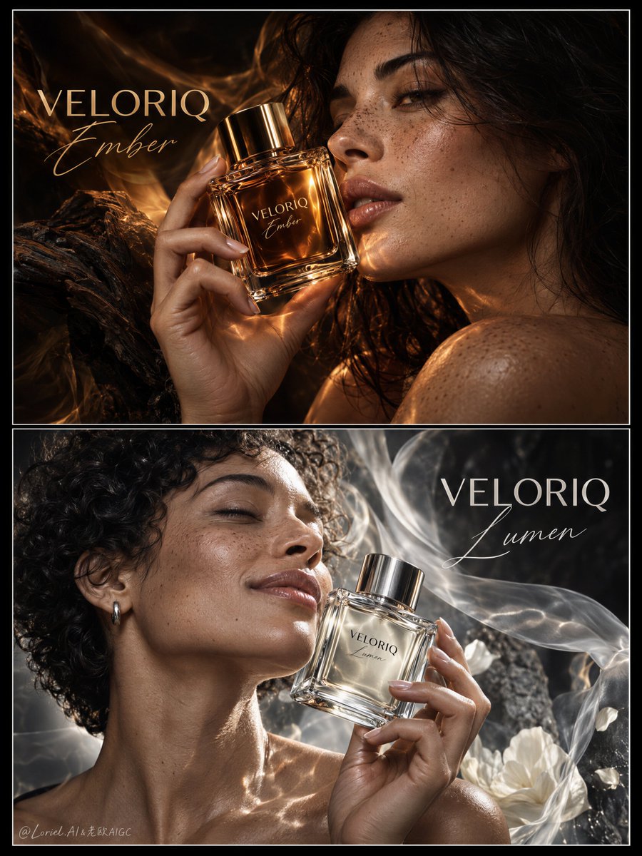
VELORIQ — Ember / Lumen Dual-Fragrance Campaign
提示詞
Create a premium dual-fragrance surreal campaign board for a fictional international perfume house named VELORIQ, designed as one vertically stacked two-panel main visual with thin white framing and museum-grade black spacing.

Preserve the structural logic of the reference as pure visual grammar only: two horizontal panels, each built around a real woman holding a real perfume bottle close to the face, but push the composition away from conventional perfume-ad layout and toward an international surreal key visual.

The perfume bottles must remain the absolute commercial hero in both panels. The women function as emotional vessels of scent, light, and atmosphere rather than standard beauty models.

IMPORTANT COMPOSITION RULE:
Repeat the same close bottle-to-cheek composition in both panels, with matching bottle geometry, similar framing, and restrained text placement, so the two panels clearly read as one fragrance family before color differences communicate the contrast.

TOP PANEL — VELORIQ Ember
Show a mature woman with dark hair and natural freckles in an intimate side-facing beauty profile, holding a square amber-glass perfume bottle beside her lips and cheek with elegant fingers.

Her face should feel close, alive, luminous, and sensorial, but not like ordinary commercial portraiture.

Push the image toward surreal fragrance editorial:
warm amber light blooms from within the glass,
soft golden reflections move across her skin,
the fragrance appears to tint the air around her.

The bottle must be extremely realistic and product-dominant:
thick glass walls,
rich amber liquid,
crisp gold-amber refractions,
polished metallic cap,
refined printed logo,
premium commercial sharpness.

Build Ember through:
amber liquid,
warm skin reflections,
woody shadow,
dry amber intimacy,
warm skin,
woody silence,
tactile closeness.

Her anatomy must be correct and graceful:
realistic fingers,
five digits,
natural lips,
fine skin texture,
visible pores and freckles,
no plastic smoothing,
no deformation.

Let the background dissolve into deep shadow and warm fragrance haze, minimizing literal environment and making the bottle-and-face relationship feel iconic and suspended.

BOTTOM PANEL — VELORIQ Lumen
Show a second mature woman with short natural curls, holding a perfume bottle from the same product family close to her cheek and chin.

This panel should feel cooler, cleaner, lighter, and more open, while remaining equally surreal and luxurious.

Build Lumen through:
pale liquid,
silver haze,
open white reflections,
luminous breath,
fresh clarity,
pale musk softness,
open air.

Silver-white clarity and pale reflections should drift around the bottle as if daylight itself has been distilled into perfume.

The bottle must clearly belong to the same VELORIQ family as Ember, but with:
a fresher liquid tone,
cooler reflection behavior,
cleaner luminous highlights.

Her expression should be softly joyful, restrained, elevated, and quietly radiant — not casual commercial smiling.

Her anatomy, hands, shoulder line, curls, and skin must feel real and premium.

The lower panel should use a near-monochrome luxurious palette enriched with:
subtle silver,
soft smoke,
faint champagne reflections,
pearl-white light.

Do not let it feel flat black-and-white.

TYPOGRAPHY
Reduce visible text radically.
The board should feel almost wordless, with product, face, and atmosphere carrying the narrative.

Use only one large brand statement per panel:
“VELORIQ Ember” in the top panel
“VELORIQ Lumen” in the bottom panel

Render each title in a refined fusion of bold modern sans-serif and couture-style script accent, placed elegantly in the negative space.

Do not include:
dense scent-pyramid blocks,
paragraph copy,
informational clutter,
promotional lines.

If any micro-text appears, it should be nearly invisible and editorial, but ideally avoid it entirely.

OVERALL EMOTIONAL STRUCTURE
The diptych should read as:
warm-over-cool,
dusk-over-morning,
skin-over-air,
amber-over-light.

The two images must feel like twin states of one perfume universe, not two separate ads.

COLOR AND MATERIAL HIERARCHY
Overall composition:
55% charcoal-black, deep neutral shadow, dark breathing negative space
20% amber bronze, dry gold, molten honey in the top panel
15% silver-grey, pearl-white, cool smoke, pale reflective light in the bottom panel
10% living skin tones and precise bottle highlights

MATERIAL SEMANTICS
Make the material language explicit and elevated:
thick refractive glass,
precise label print,
metallic cap reflections,
amber liquid depth,
pale liquid clarity,
skin pores,
freckled texture,
natural curls,
moist lips,
fingernail sheen,
subtle atmospheric bloom around bottle edges.

The perfume itself should feel like the source of altered reality.

RENDERING TARGET
Photoreal luxury fragrance diptych,
ultra-refined beauty realism,
product-dominant hierarchy,
reduced typography,
surreal atmospheric shaping,
world-class print finish,
premium border framing,
international gallery-level visual intelligence.

QUALITY CONTROL / NEGATIVE CONSTRAINTS
Photoreal only.
Correct bottle geometry.
Crisp label placement.
Correct hand anatomy.
Five fingers.
No extra fingers.
No missing fingers.
No fused fingers.
No broken wrists.
No distorted face.
No asymmetrical eyes.
No waxy skin.
No plastic skin.
No garbled text.
No random letters.
No cheap beauty-ad styling.
No muddy shadows.
No dirty haze.
No overdecorated layout.
No real brand names.
No real person names.
No style drift.
No AI slop.